
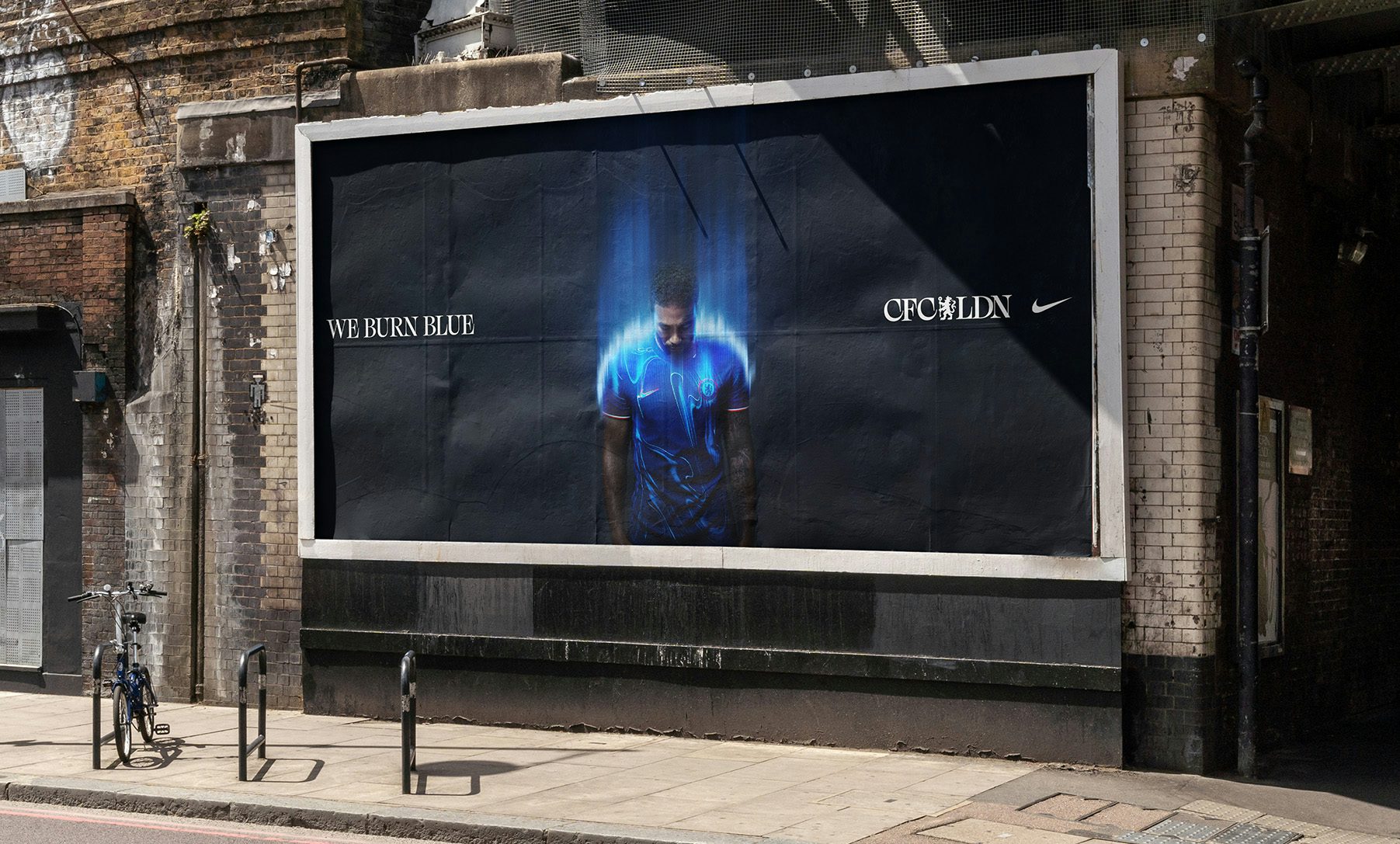
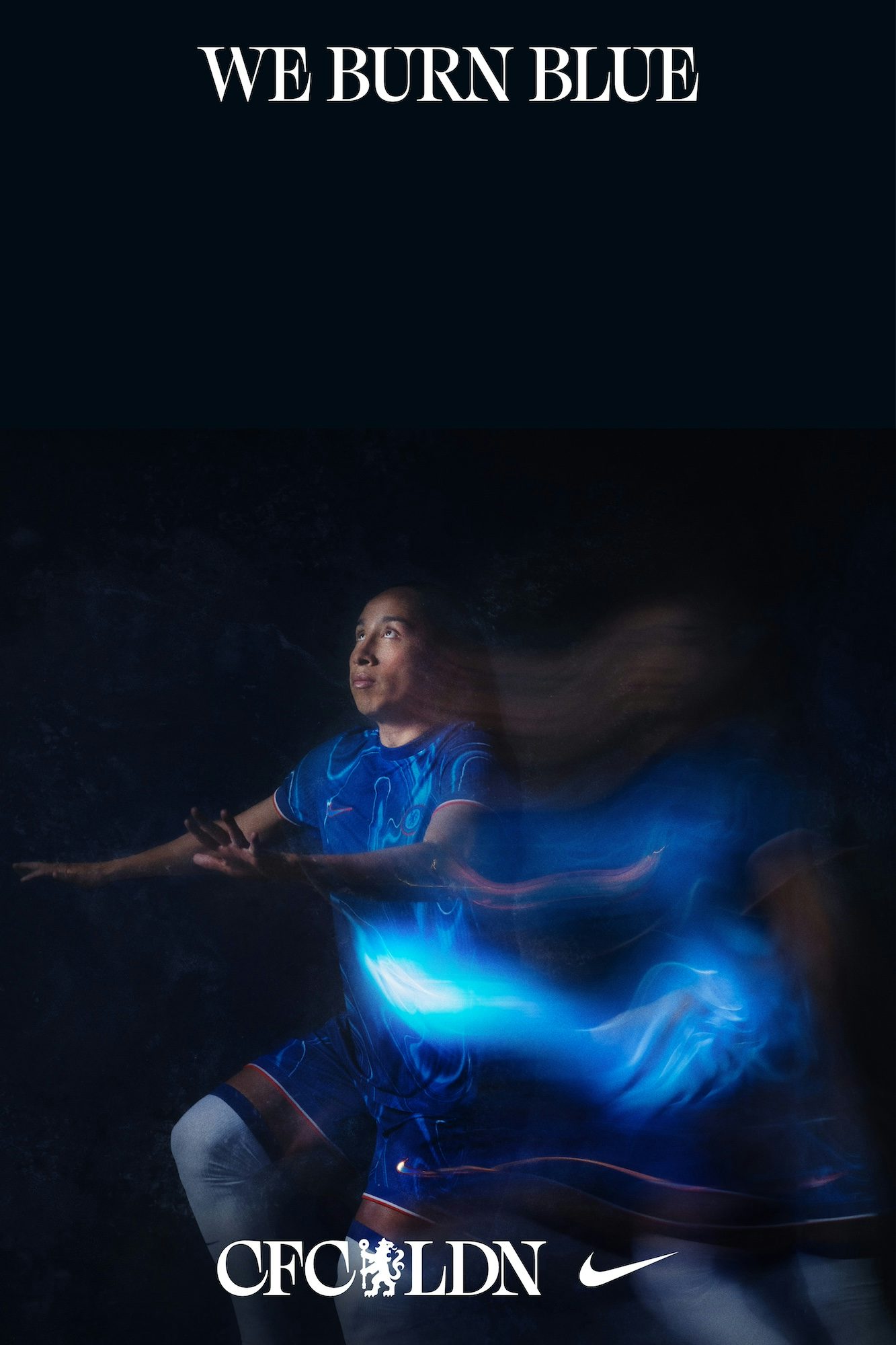
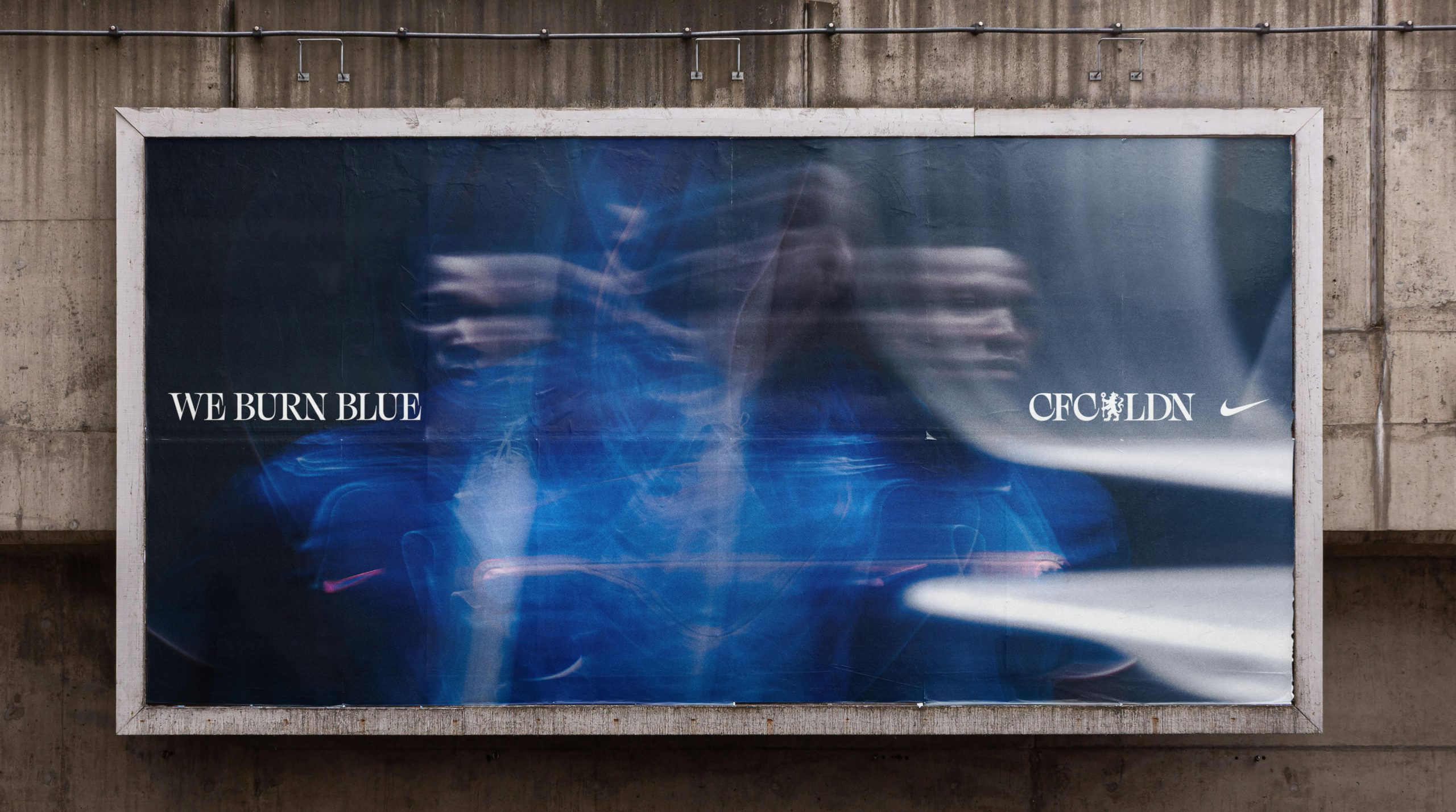
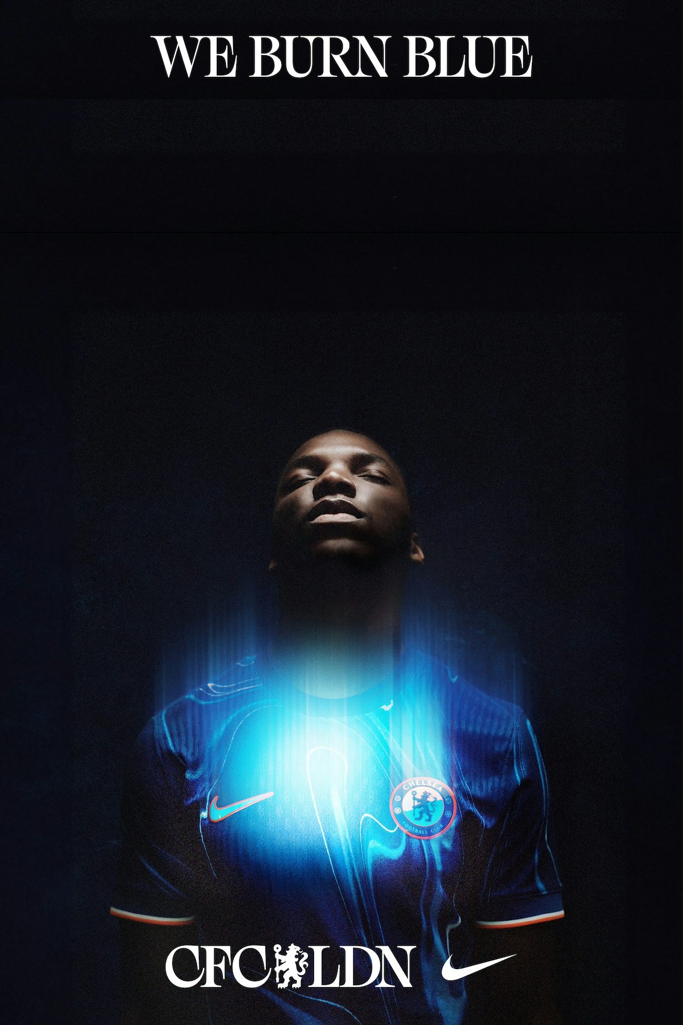
Chelsea FC launches new visual identity and home kit campaign
Made in partnership with Uncommon Creative Studio, the launch unveils a new brand narrative – We Burn Blue – via an arresting visual campaign
Chelsea FC and Nike’s home kit for the coming season arrives with a new “melting pot” design that aims to express the “new fire” arriving at the club via recently announced head coaches Enzo Maresca and Sonia Bompastor.
Uncommon has created a campaign leaning into the aesthetic of a blue flame, using SFX and visual techniques “to capture the energy, passion and determination that burns inside every Blue”, according to the agency. Starring in the campaign, which includes film, photography, design, outdoor and social, are Cole Palmer, Sam Kerr and Moises Ciacedo as well as some of the club’s most exciting youth talent.
Both the stills photography and film were shot and directed by lifelong Chelsea fan Thomas Van Kristen. The soundtrack for the film is by London-based producer and DJ Joy Orbison, who has created a bespoke edit of his track Flight FM.
Uncommon has also designed a new visual identity for the club, which appears throughout the campaign. It hones in on the iconic Chelsea lion logo, pairing it with ‘CFC LDN’. This is the first appearance of the visual identity which will continue to come to life across the club, stadium and players throughout the season.

“This thinking encapsulates the club and players sentiment ahead of the new season, as they bring a new energy and new fire to Stamford Bridge,” says Nils Leonard, co-founder at Uncommon Creative Studio. “This is only just the beginning — this is about partnering with the fans, players and club to create the brand Chelsea has always deserved, to bring the iconic London club to the world.”
Credits:
Creative Studio: Uncommon Creative Studio
Production Company: Common People Films
Director & Photographer: Thomas Van Kristen
Typography: F37® Foundry
Latest from CR


