
Italian design heritage and op art collide in Bacàn’s branding
The team at Pentagram have dug deep into the roots of Italian restaurant Bacàn to create an eye-catching, Futurist-inspired identity
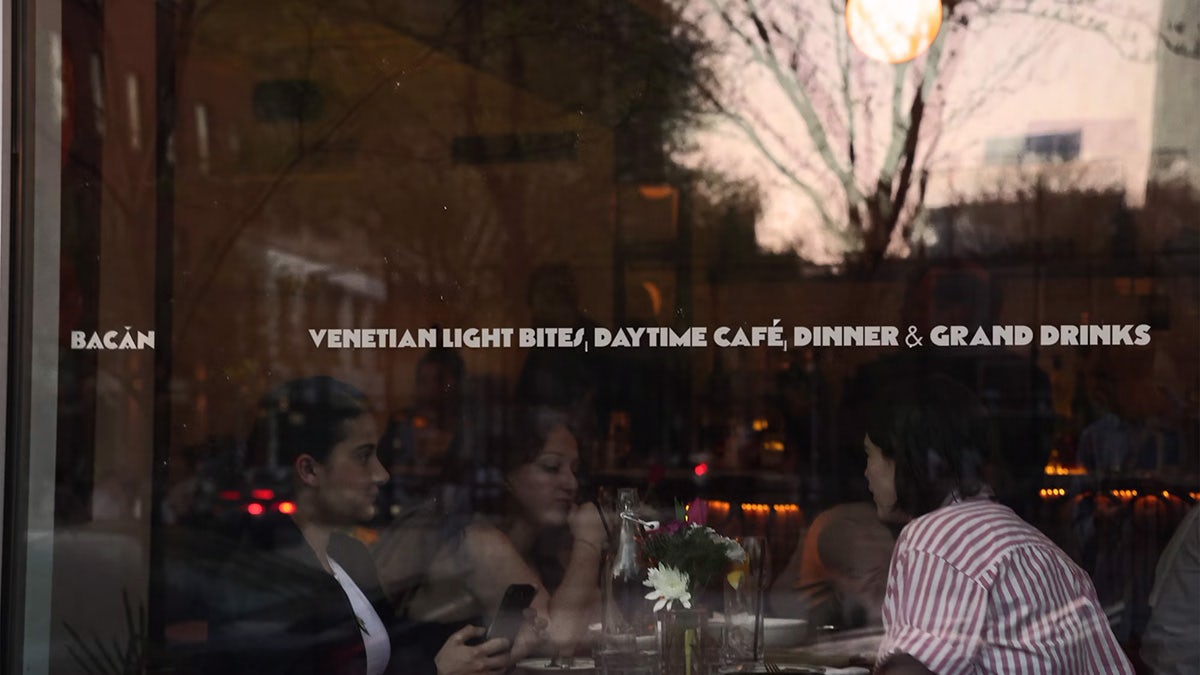
In the Venetian dialect, the term ‘bacàn’ refers to the loud sound that emanates from a great dinner party – the overlapping noises of passionate conversation and the clinking of glasses and cutlery. It is the perfect word to describe the hearty quality of Italian cuisine, full of cheer and good food, which is why restauranter Nico Donà chose the name for his Brooklyn-based eatery, where he offers Venetian-style light bites, dinner, drinks and, of course, a lively atmosphere.
Keen to pair the name Bacàn with a visual identity for his restaurant that could reflect its suggestive nature, he reached out to Pentagram’s newest partner Andrea Trabucco-Campos to work on the branding. He and his team began looking into how sound and audio qualities can be represented visually, as well as how these findings can be paired with Italy’s rich design heritage.
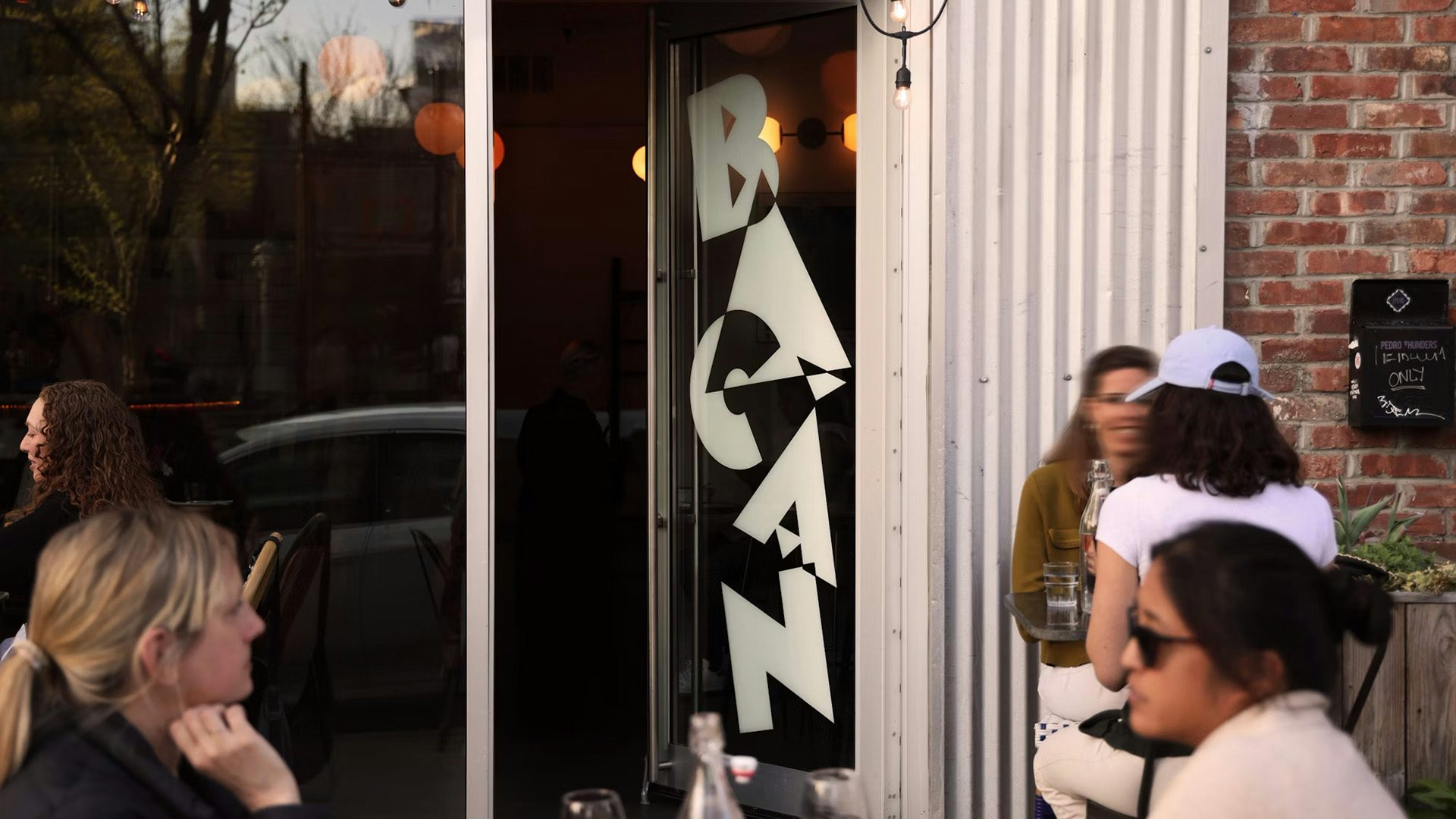
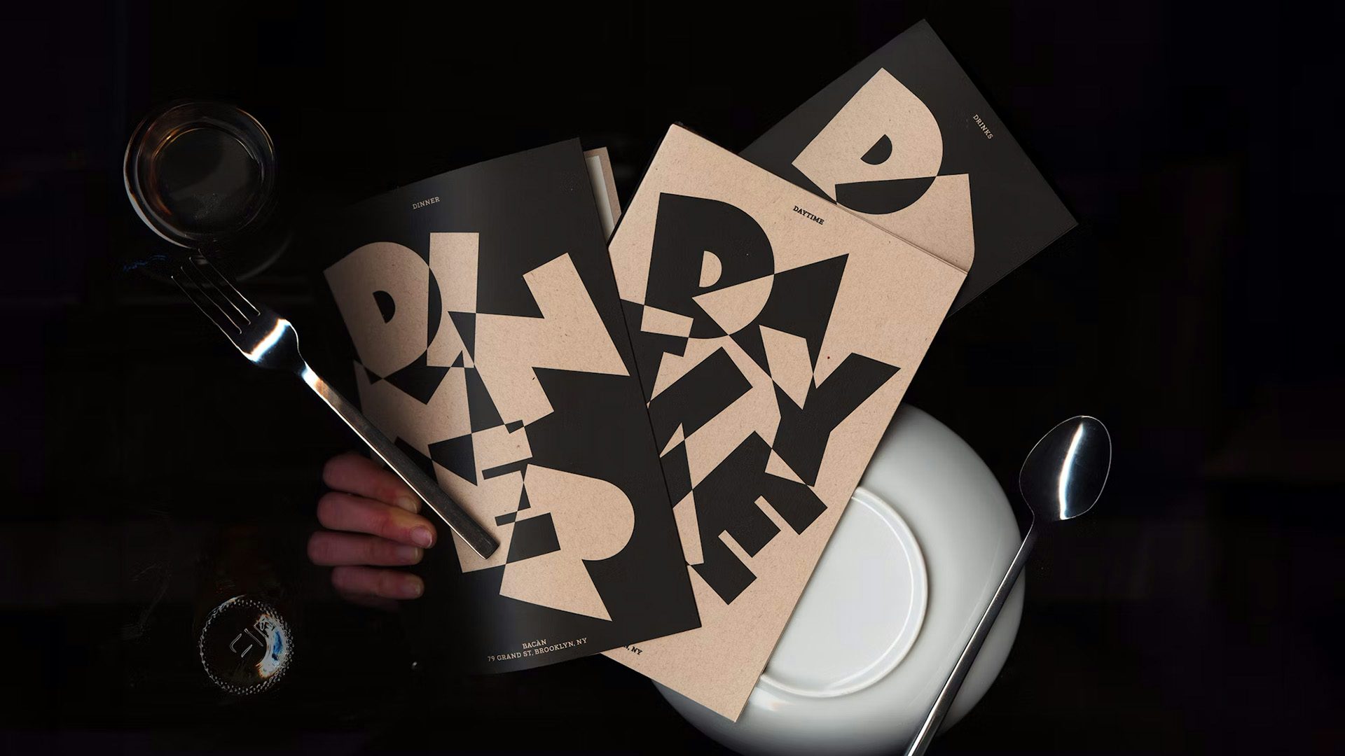
Following the research period, the team at Pentagram came up with the idea of using letterforms as sound waves that expand, collide and overlap – much like the conversation that takes place within the restaurant. These letterforms are part of a custom typeface called Grand Bacàn Sans, which comes in three varying styles, ranging from heavy to heaviest (or loud to loudest). Bold and expressive, they draw inspiration from the wood and metal typefaces that dominated the visual language of Italy in the early 1900s.
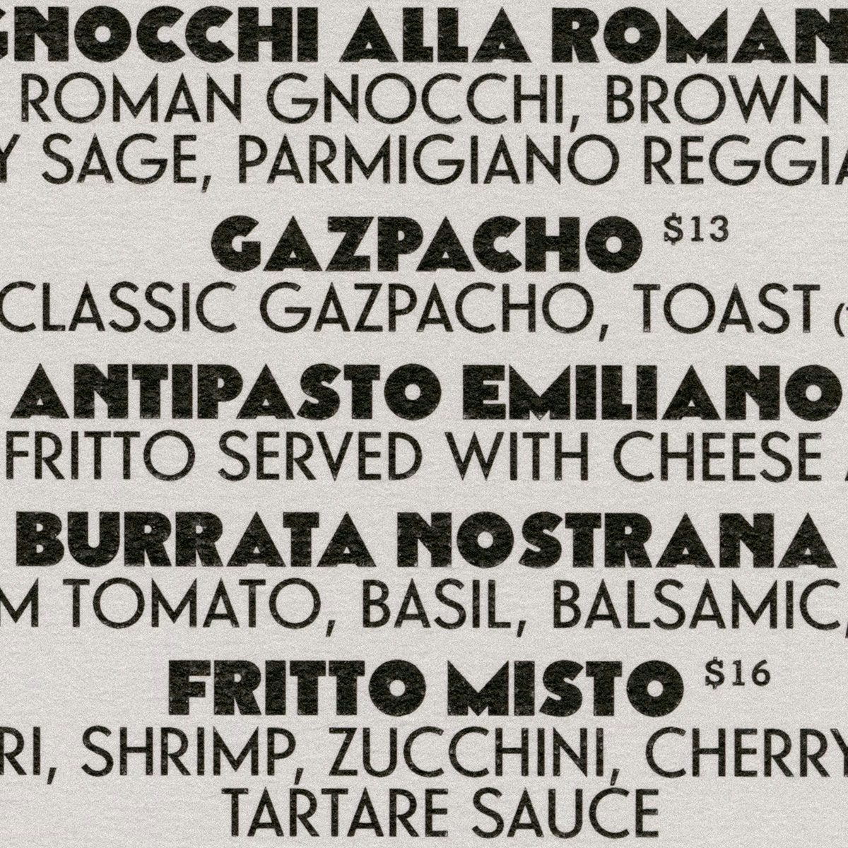
Across the identity, Grand Bacàn Sans is accompanied by an equally characterful – but slightly more practical – slab serif from Optimo called Piek. Described as feeling “both old and new”, it complements the heritage feel of the rest of the branding while helping with legibility on menus, posters and other materials.
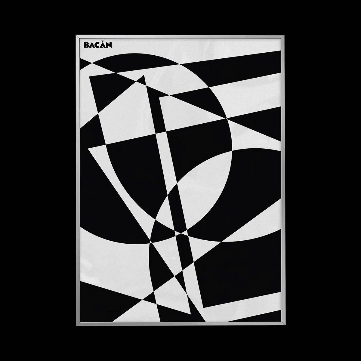
Decidedly playful, the typefaces also informed the creation of several small illustrations “that build on the language of overlap”, according to the agency. These drawings, when expanded using motion design, create abstract compositions that are reminiscent of op art and the work of early Futurist painters such as Fortunato Depero. “This tension between communication and abstraction is at the heart of the visual interest for the identity,” the team explains.
Both the typefaces and the illustrations are rendered in black and white, or positive and negative, to once again speak to the op art tradition, which favours this monochromatic approach in order to achieve the most contrast possible. Beyond giving the identity a timeless and classic feel, this colour palette, or rather lack of, also speaks to mid-century Italian vernacular, bringing together the many references across the project.
Latest from CR


